Logo
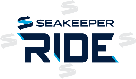
The Seakeeper Ride logo projects confident forward momentum through capitalized letters, a heavy font weight, and sharp angles. The Lagoon Blue slashes reinforce this movement and enhance the slash effect of the R, I, and E letters. The colors, Deep Sea Blue and Lagoon Blue, are shared with the Seakeeper brand and help to join the two identities.
The Seakeeper Ride logo combines two elements: the Seakeeper Horizontal logo and the Ride logo word mark. Position, size, and color, along with the spatial and proportional relationships of the Ride logo elements, are predetermined and should not be altered.
Used consistently, the logo will reinforce public awareness of the brand.
Logo Variations


Minimum Size and Spacing
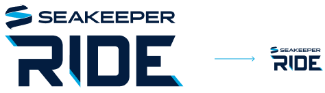
Care must be taken to ensure an optimum appearance of the logo in every size. The Seakeeper logo must be legible at all times.
The spacing around the logo and typography can be freely selected in order to ensure a clear and unconstrained appearance of the logo. For orientation purposes, however, the Seakeeper S Mark height can be used as the minimum spacing guide.